Cuisinello
| Roles: | Tools used: |
|---|---|
| User Research & Strategy | Sketch |
| UX/UI Design | InVision |
| Prototyping | Marvel |
| Usability Testing | Principle |
| Branding & Logo | Whimsical |
| Responsive Web Design | Adobe Photoshop CC |
| HTML/CSS | |
| Bootstrap v5 |
Project Background
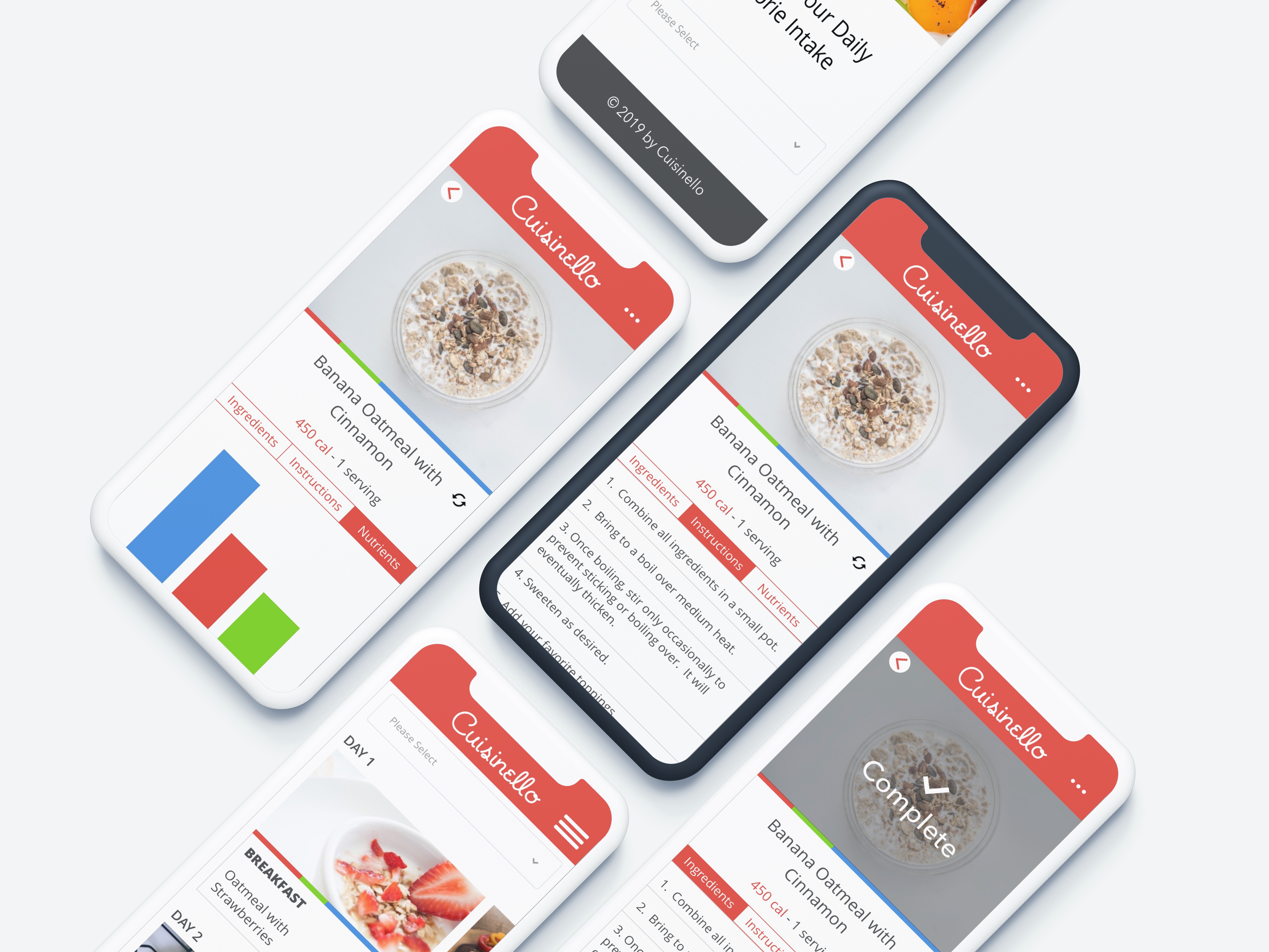
“Cuisinello” is a simple meal planning app optimized to order in one click all ingredients based on your current meal plan. You choose the calorie intake, and the Cuisinello app gives you a set of meals you need to eat during the day. The app is integrated with Amazon Fresh, so you only need to click one button to have all ingredients in your Fresh cart. “Cuisinello” wants to see the high-fidelity mockups of their application and new branding. The Challenge was to design the recipe planning app in as few steps as possible (client’s requirement). The fewer steps - the better – that was the idea. I was able to minimize the experience to two clicks.
My Role
I was hired to conduct the whole UX design proces starting from UX research, through wireframing, ending with visual design.
Process
Empathize
Define
Ideate
Design
Prototype
Test
Final UI Design
Step 1: Empathize
Methodologies:
- Competitive Analysis
- User Surveys
- User Interviews
- Client Interview
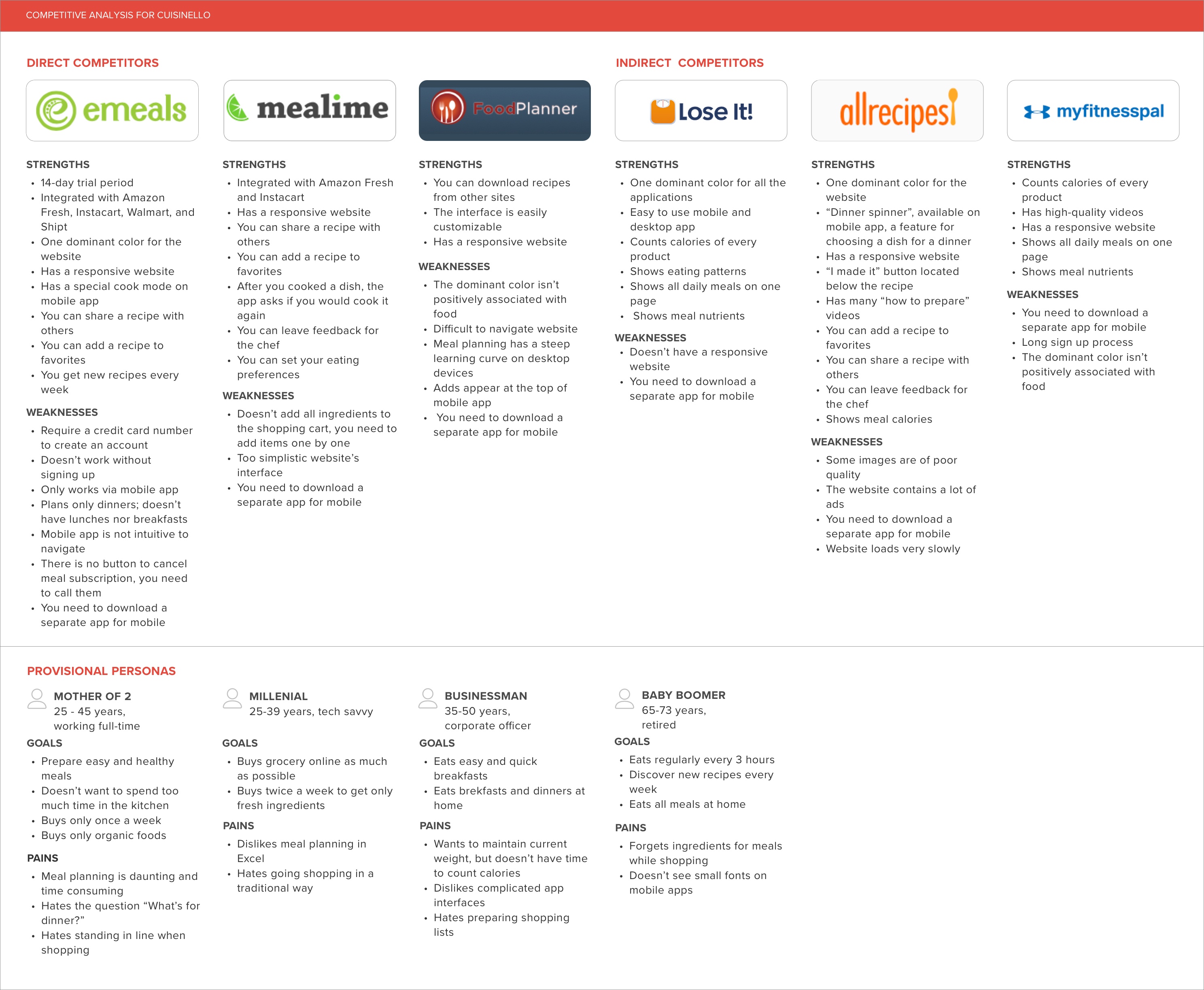
In order to understand Cusinello’s position in the market, I need to compare it to other meal planning websites/apps. To achieve this goal, I started with the primary research – a competitive analysis of 6 meal planning and calorie tracking apps. I divided the competitive analysis into two groups:
- Direct competitors (eMeals, Mealime, FoodPlanner)
- Indirect competitors (Lose It, Allrecipes, MyFitnessPal)
I also provided provisional personas accordingly.
Competitive Analysis
Then, I conducted secondary research (surveys and interviews) to gain a better understanding of the people I’d be designing for. My goal was to get to know how people plan their meals, for how many days they plan their meals and what problems they encounter during planning. I also wanted to answer the questions:
- What benefits do users receive from online planning meals compared to traditional planning?
- Where do people buy their groceries?
- Would they buy groceries with one click if they have a chance to do so? If no, why not?
I prepared user surveys and interviews, then I conducted them. I conducted a survey with 30 participants who had previous experience in meal planning. I recruited them via Slack channel. The survey was conducted online – I sent the shareable link via Google Docs.
For the interview, I chose 5 participants from two groups:
- adults between 20-45 years old who have meal planned before
- adults between 45-65+ years old who go shopping in a traditional way
I conducted the interview in person and via Skype. During interviews, I concentrated mostly on the meal planning process by asking related questions such as “Can you walk me through your meal planning process”, “Have you ever used meal planning apps before? What is your impression?” or “What features would you like to see in a meal planner?”.
In the end, I conducted an interview with the client – Cusinello’s founder to get the idea of what we’re going to work on. I asked about the main goal of the application and the problem we’re going to solve. I also asked about the vision for the website and word associations with Cuisinello.
“Modern. High Tech. Easy. Food. Fast. That’s Cusinello”
KEY TAKEAWAYS FROM SURVEYS:
- Most people usually plan for 3 days
- Most participants would like to see the following features: shopping list, list of ingredients, instructions on how to prepare a dish, calorie tracker, photo of a dish, and "add all ingredients to Amazon Fresh" button
- All interviewees use a mobile phone during cooking
KEY TAKEAWAYS FROM USER INTERVIEWS:
- People usually plan maximum one a week, most participants plan for 1 to 3 days
- Most interviewees plan using pen and paper; one person uses computer
KEY TAKEAWAYS FROM A CLIENT INTERVIEW:
- “The goal of my application is to make meal planning process as fast as possible. The user only needs to choose the daily calorie intake and the app will automatically generate a meal plan.”
- He’d like to include 1-click “Add all ingredients to Amazon Fresh” green button that concatenates all the meals into one shopping basket, including correct qualities.
- He associates "Cusinello" with the vibrant red.
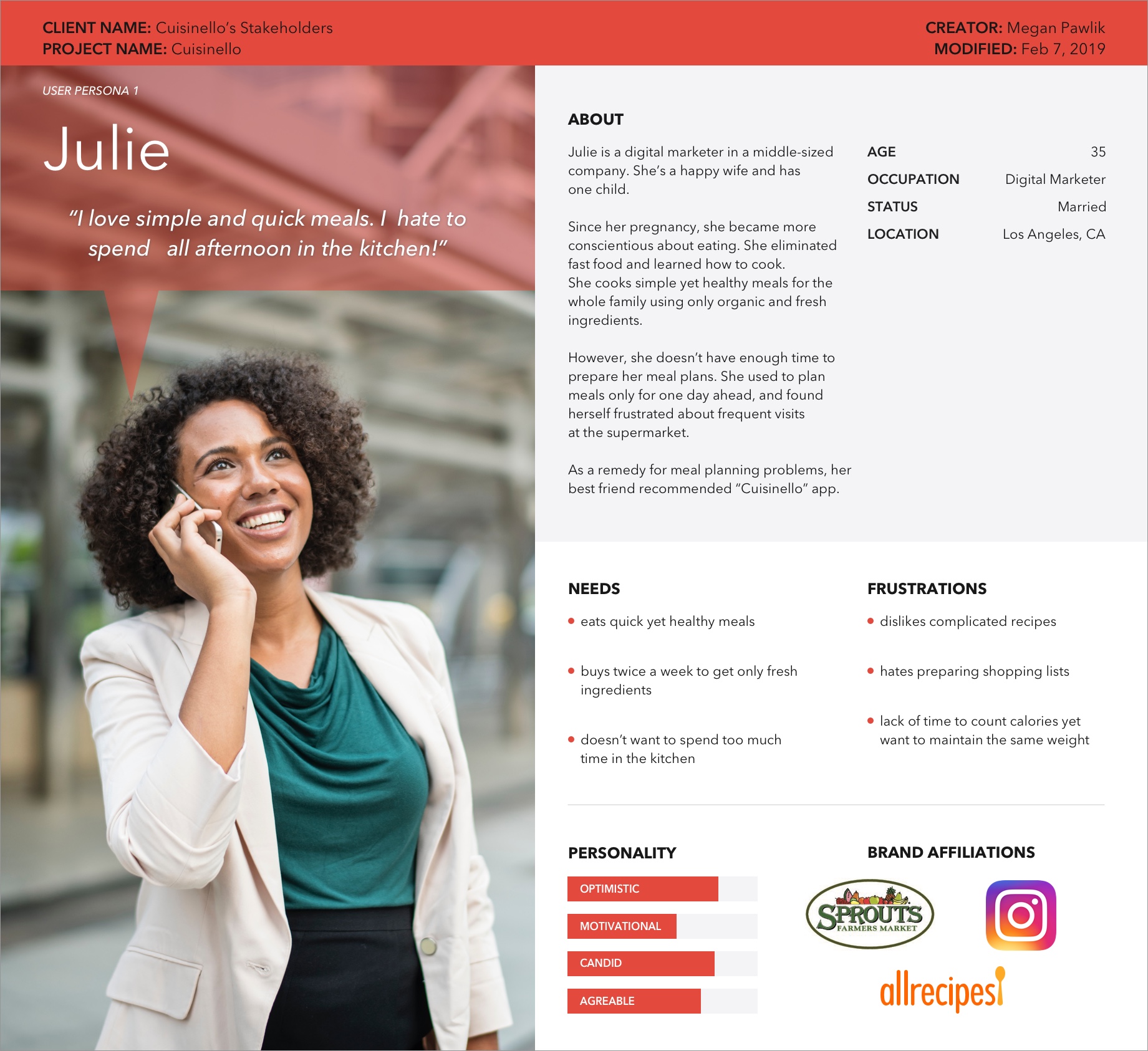
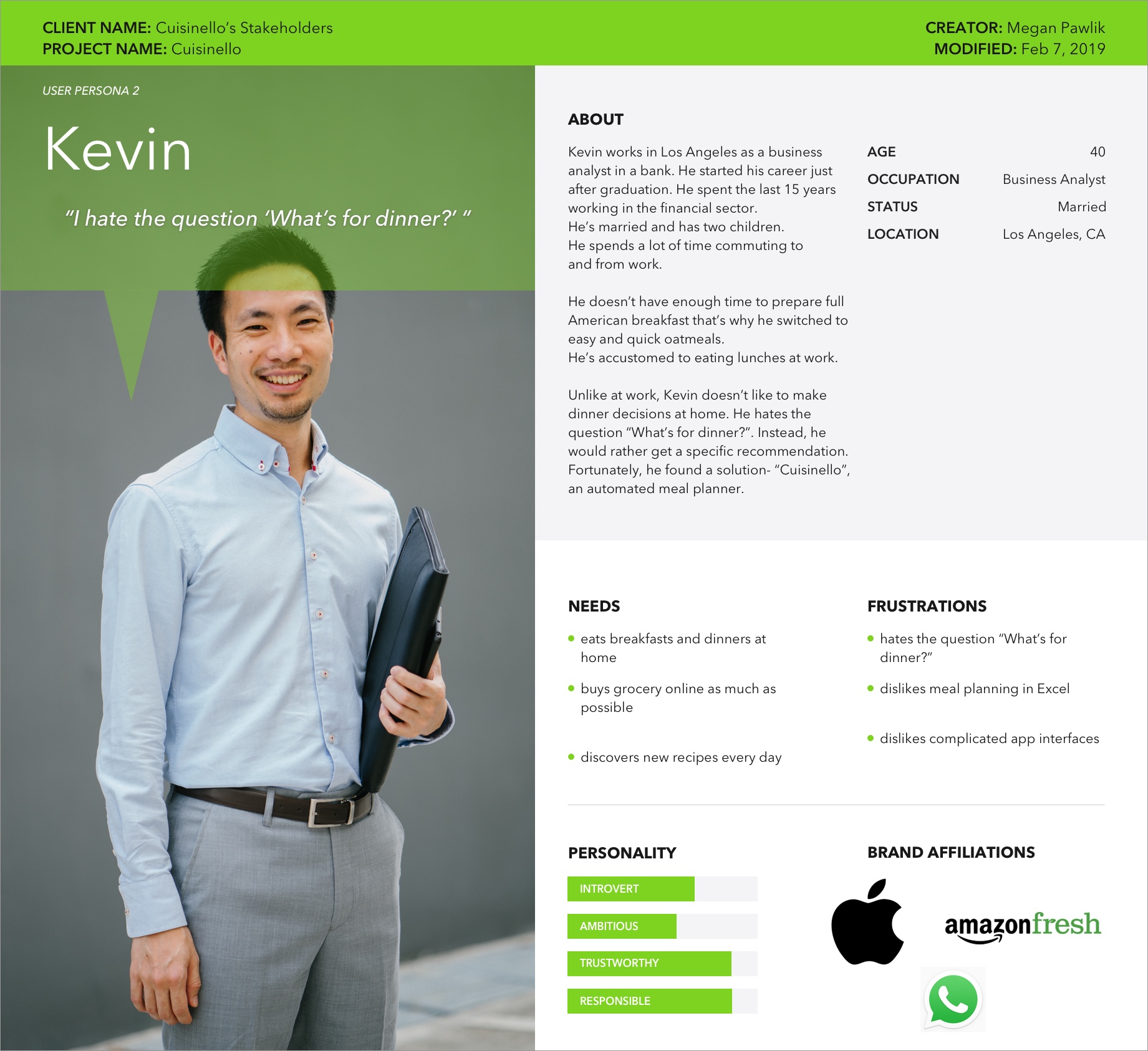
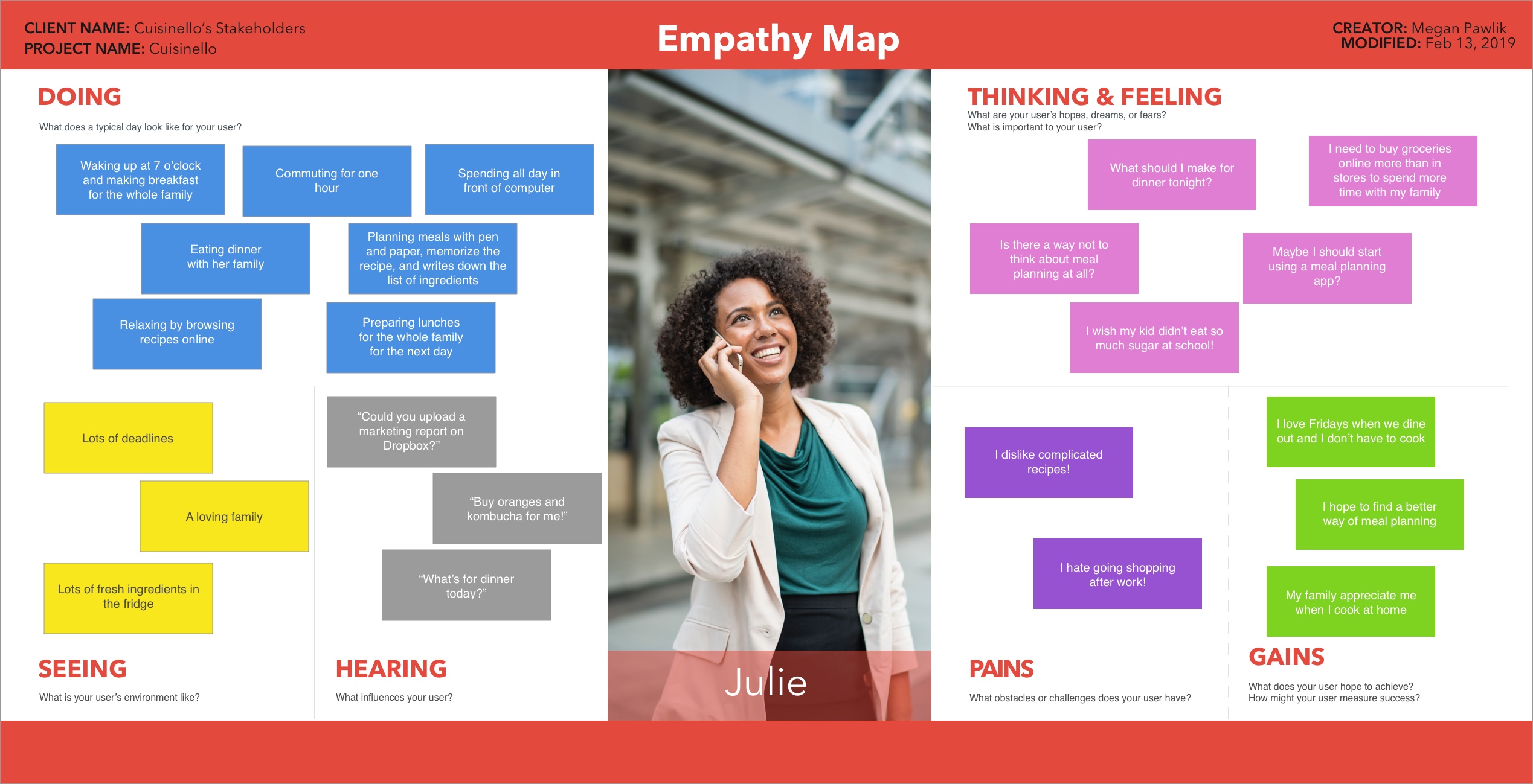
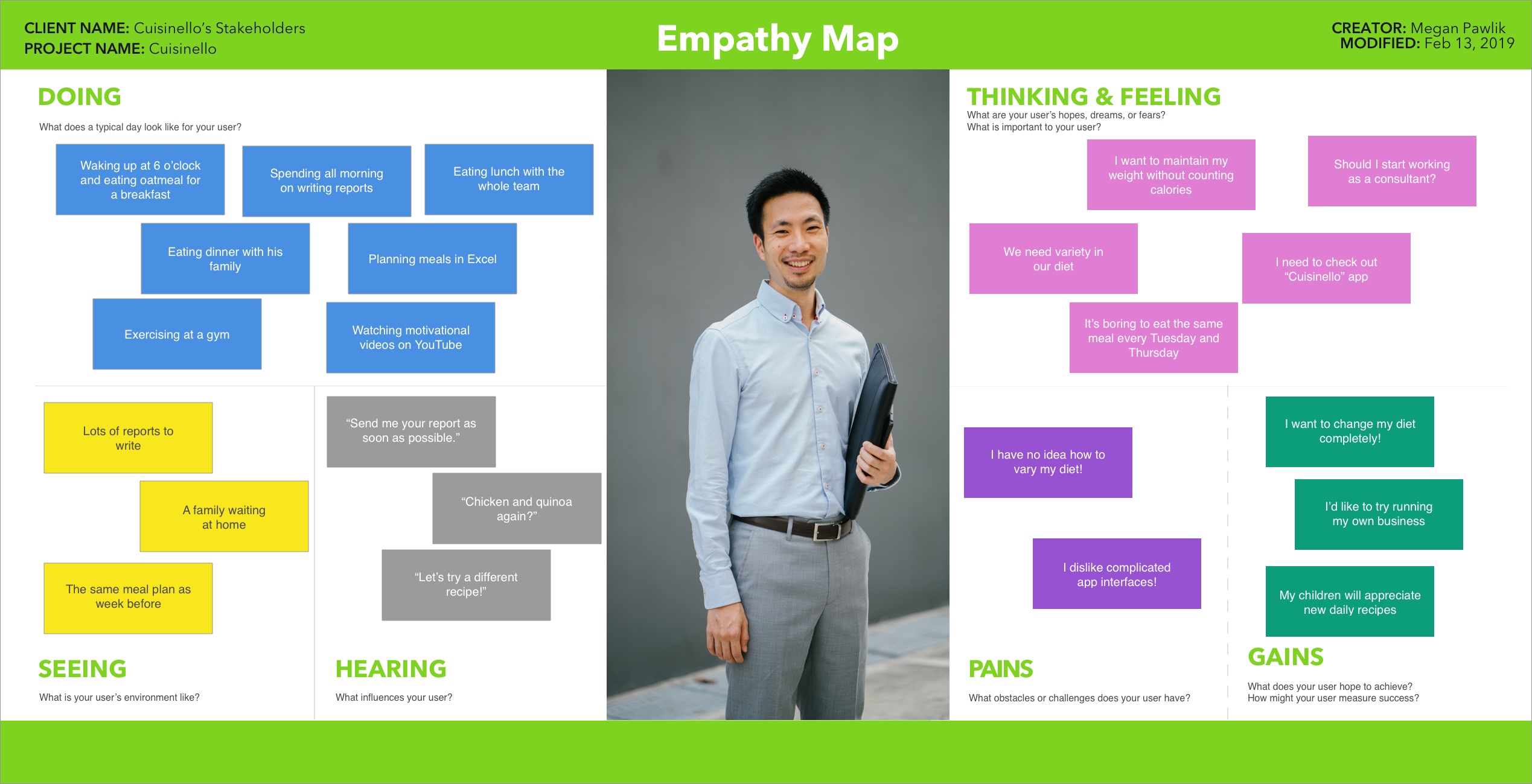
Later, I synthesized the user research data and developed two user personas and two empathy maps. I gathered all information from surveys and interviews and prepared “Research Summary” in a deck. You can read more about it – here.
By this point, I had a clearer understanding of the key business goals and features we’re going to include in this app.
User Persona 1
User Persona 2
Empathy Map 1
Empathy Map 2
Step 2: Define
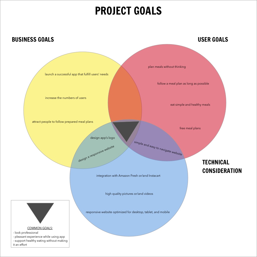
I created Projects Goals to summarize all types of goals I needed to take into account during the design process such as business goals, user goals, and technical consideration.
Project Goals
I also prepared a feature roadmap to make sure which features are the most important and which ones can come at later stages of the project. I divided the feature roadmap into four sections based on the feature’s necessity:
- P1: Must have
- P2: Nice to have
- P3: Surprising and delightful
- P4: Can come later
Feature Roadmap
Step 3: Ideate
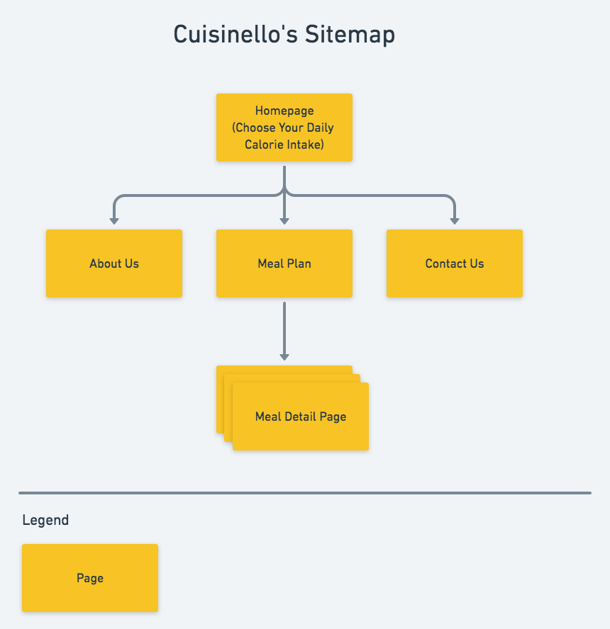
Knowing the project goals and features I’m going to include, I come up with a strategy on how Cusinello’s app should be designed. From my research, I decided that the focus of the website should be on meals provided by the app. My research also showed that users love simple and straightforward interfaces. The next step was creating the site map to determine the pages I needed to design. According to my research I needed:
- 1. Homepage (with a dropdown where you can choose your calorie intake and generate the meal plan for the next days)
- 2. Meal Plan Page (with a list of meals planned for a couple of days)
- 3. Meal Detail Page (where you can get more information about your meal)
- 4. Order Confirmation Page
- 5. About Us Page
- 6. Contact Page
Sitemap
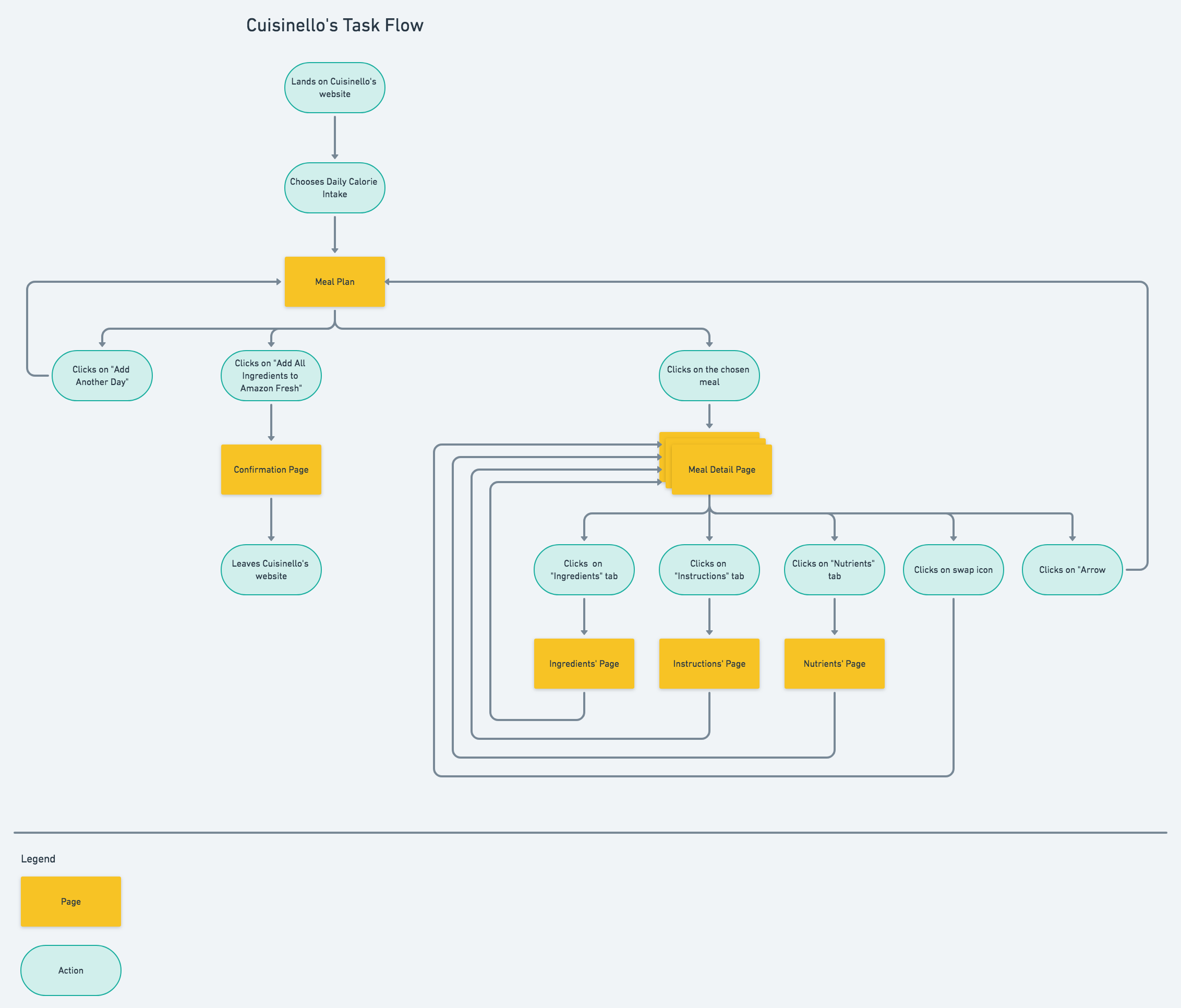
I also created the task flow to show how users travel through the app while performing a specific task. The main goal for the user is to create a meal plan for a couple of days based on the provided calorie intake. The user chooses the preferred calorie intake and he is automatically redirected to the Meal List Page where he can see a list of meals.
Task Flow
The last step before designing was creating a user flow.
User Flow
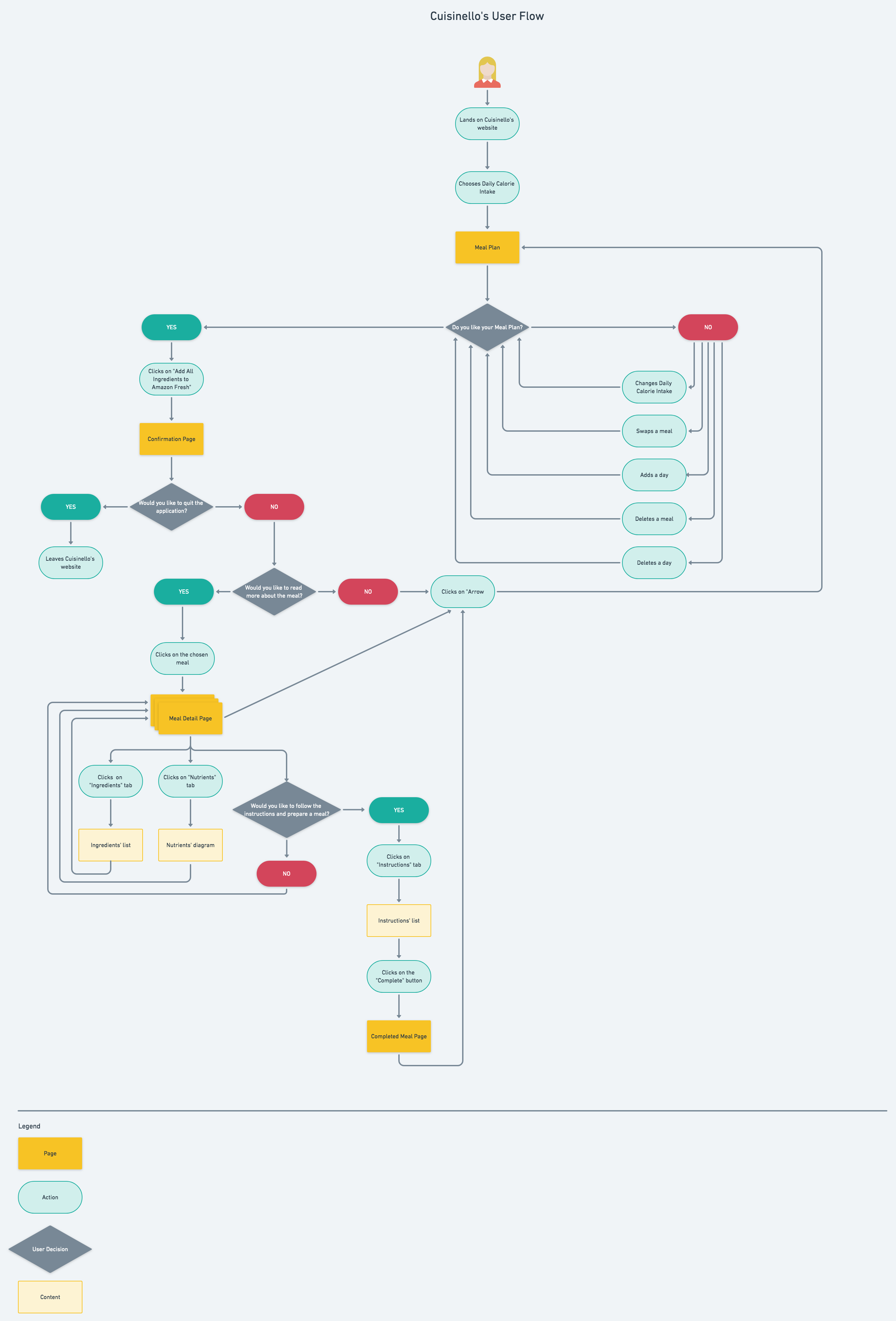
Based on my research, sitemap, task and user flows, I concluded that my design should have the following features:
- A responsive website used across different devices
- Homepage with calorie intake dropdown
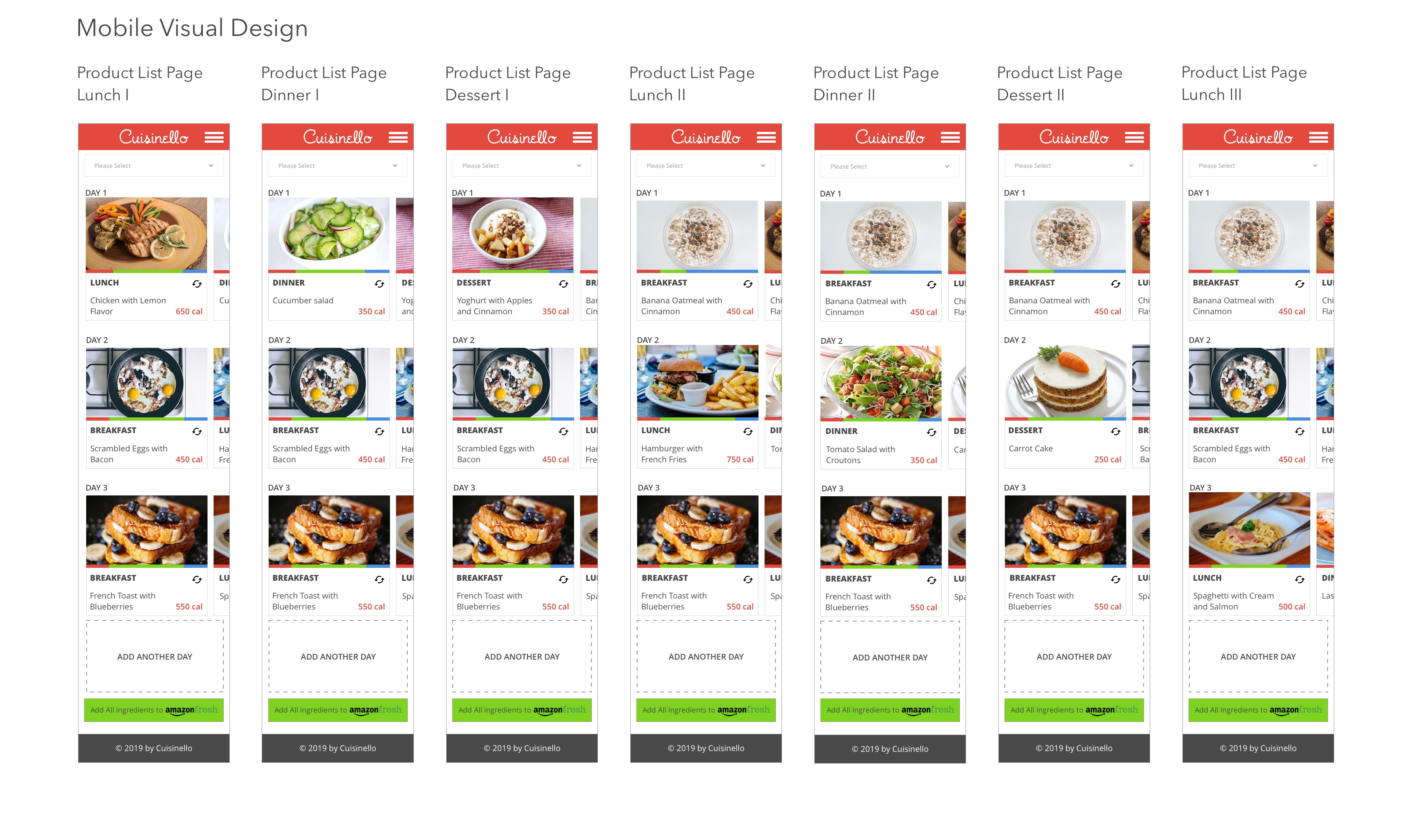
- Meal List Page which will show days with a list of meals
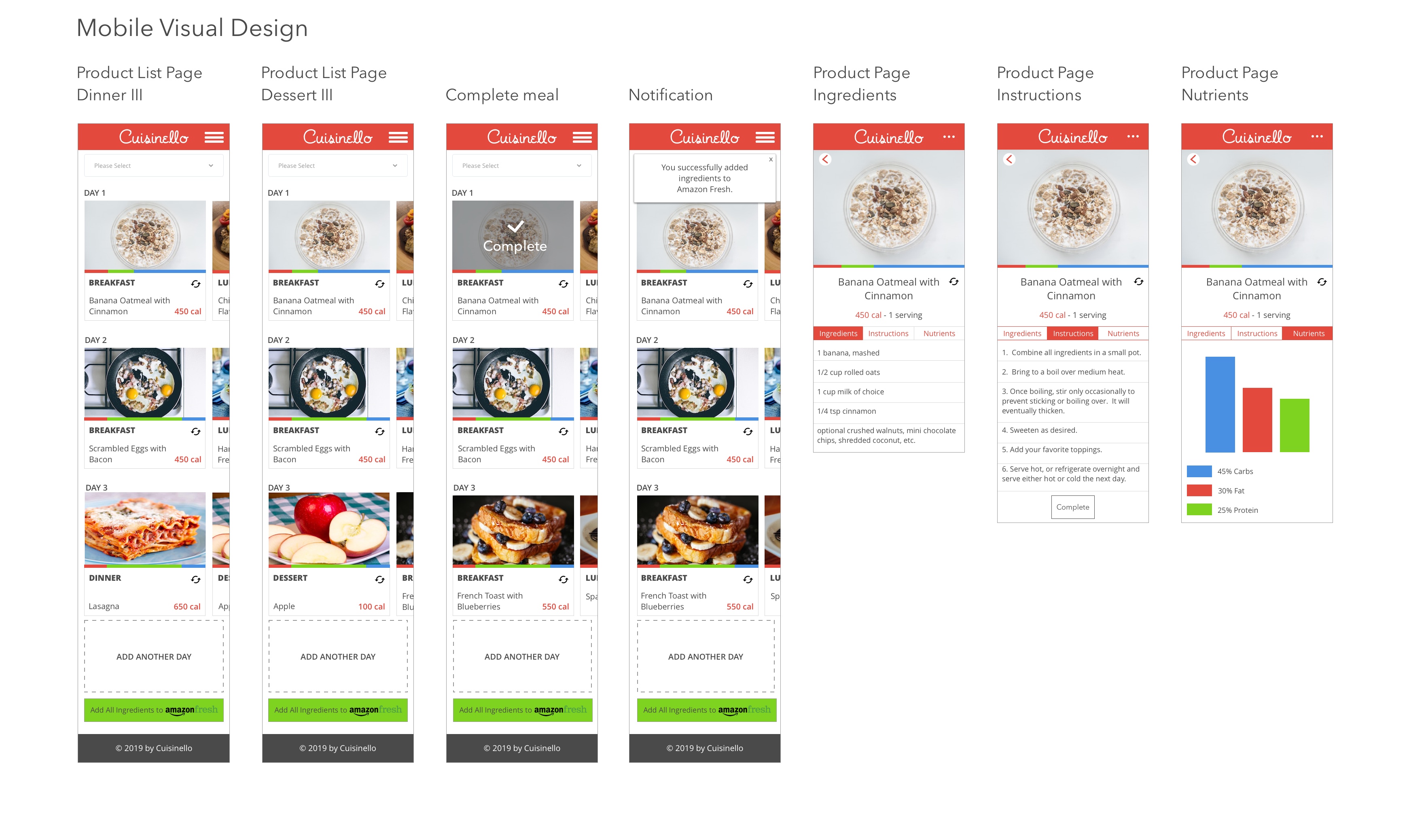
- Meal Detail Page which will include a photo of the meal, all ingredients, calorie intake, instructions on how to prepare the meal, nutrients, “complete” and “delete” buttons
- “Add all ingredients to Amazon Fresh” button
Step 4: Design
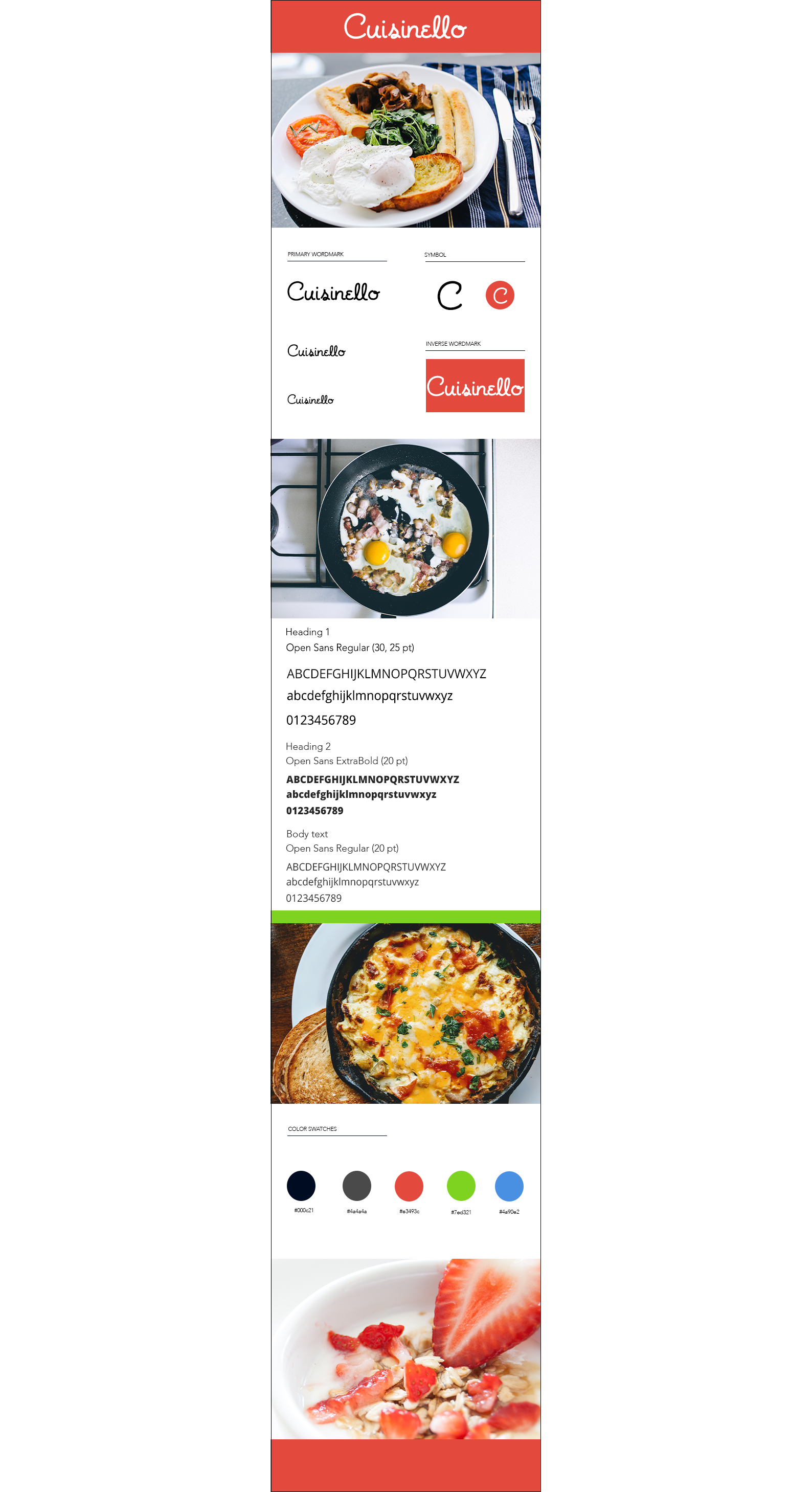
Based on research and a client’s interview, I prepared “Cusinello’s Color Style Tile” showing logo, fonts, and colors used in Cusinello’s app.
Color Style Tile
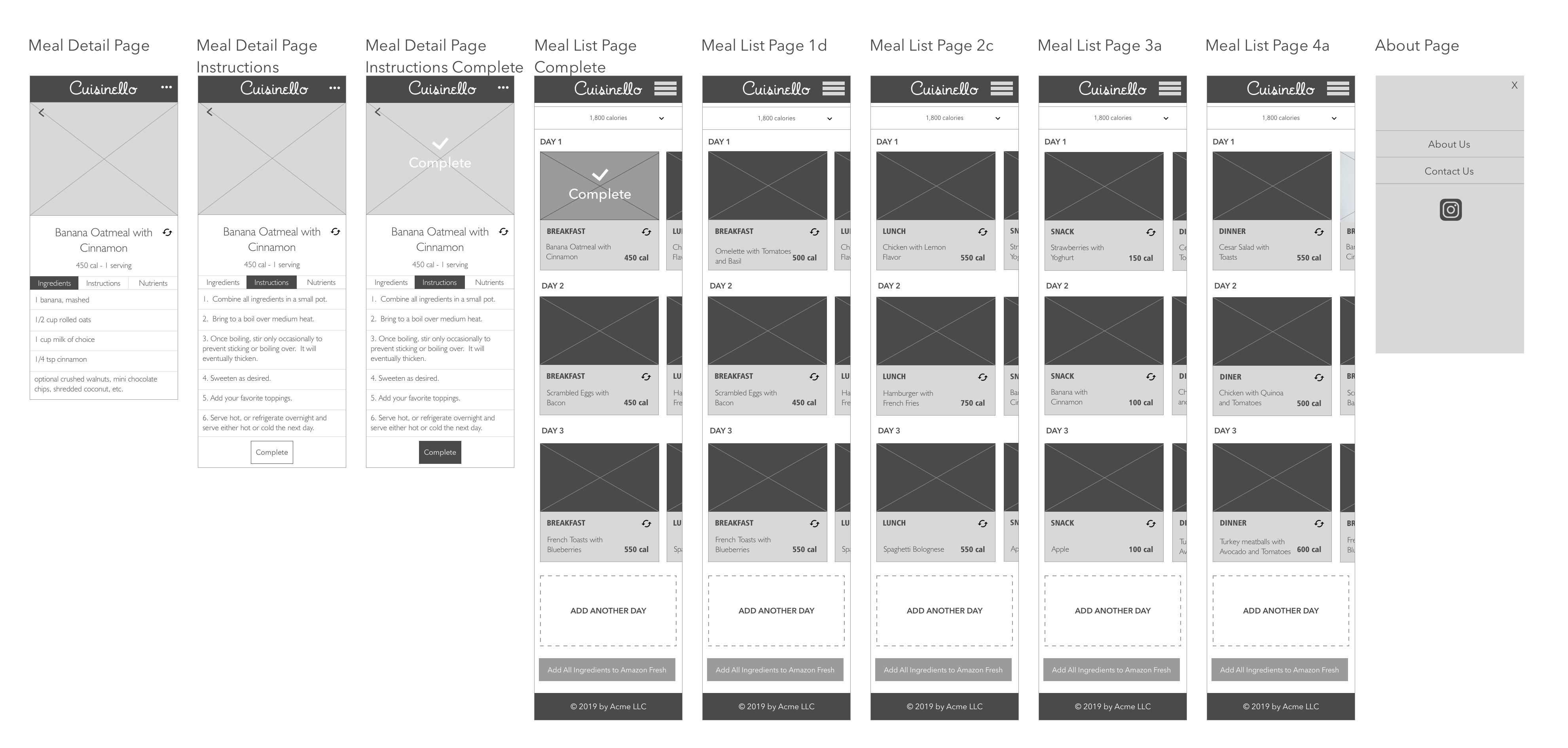
Then I created mid-fidelity wireframes to grasp the idea of how the final app would look like.
Mid-fidelity wireframes

Step 5: Prototype
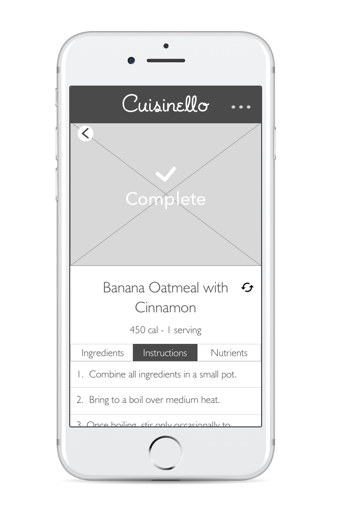
I combined all wireframes together and created a prototype of the app.
Step 6: Test
The next was preparing a Usability Test Scenario and gathering participants. I gathered 4 participants (40-65 years old) having meal planning experience via my personal network of friends and family. I conducted the usability testing in person using my computer and via Skype using a remote sharing screen. I used two scenarios in my usability testing:
SCENARIO #1
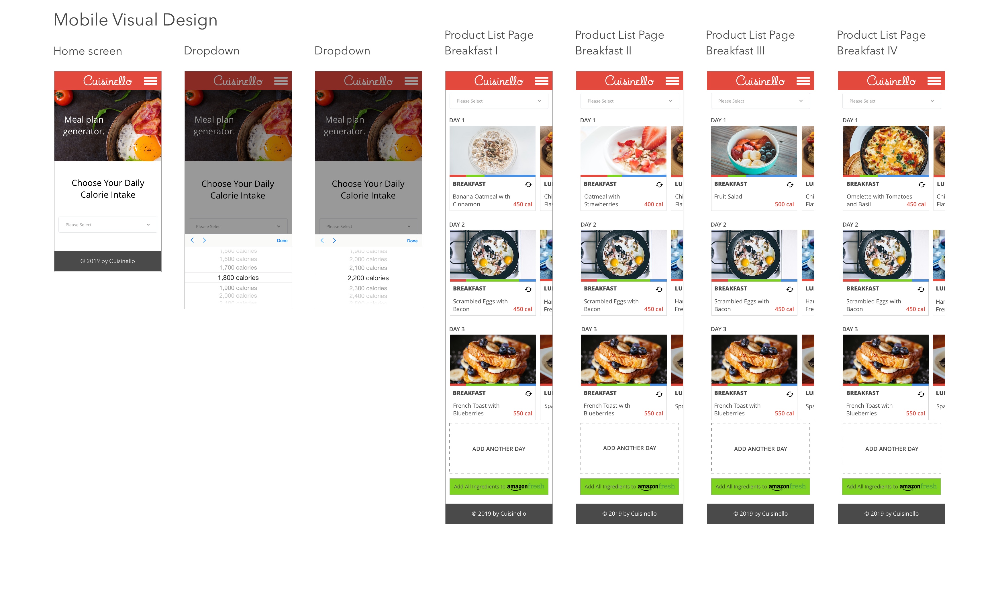
Let’s assume that you put some weight after Christmas, and you’re currently on an 1800-calorie diet. You go to Cuisinello’s website and choose the right meal plan for you. Unfortunately, the first recommended breakfast doesn’t suit you, so you change your meal a few times to find Omelette with Tomatoes and Basil. When you find your breakfast, you add all the ingredients to Amazon Fresh.
SCENARIO #2
Let’s assume that you want to maintain your weight. You’ve already bought all the ingredients on Amazon Fresh and came back to Cuisinello’s website to read the instructions how to prepare a meal. You go to Cuisinello’s website and choose the default 2200-calorie meal plan. You go to the first breakfast “Banana and Oatmeal with Cinnamon” and read meal instructions, follow them step by step, then mark a meal as complete.
I conducted usability testing using the high-fidelity prototype:
Key usability test findings:
- Participants completed tasks without any hesitation
- One of the participants liked that the workflow was smooth
- Another participant said that “interface is simple and straightforward”
- Somebody suggested using Amazon logo instead of just simple text on the button
Changes
- I followed one of the participant's idea and added Amazon Fresh logo to the button.
- I changed the dropdown to the bottom sheet with a dropdown. It looks much cleaner and modern than the previous solution.
- I also changed the color of notification from light green to white.
Step 7: Final UI Design
I made changes based on usability testing and incorporated them in the final UI design. Below there is a brief excerpt from my UI design.
Visual Design

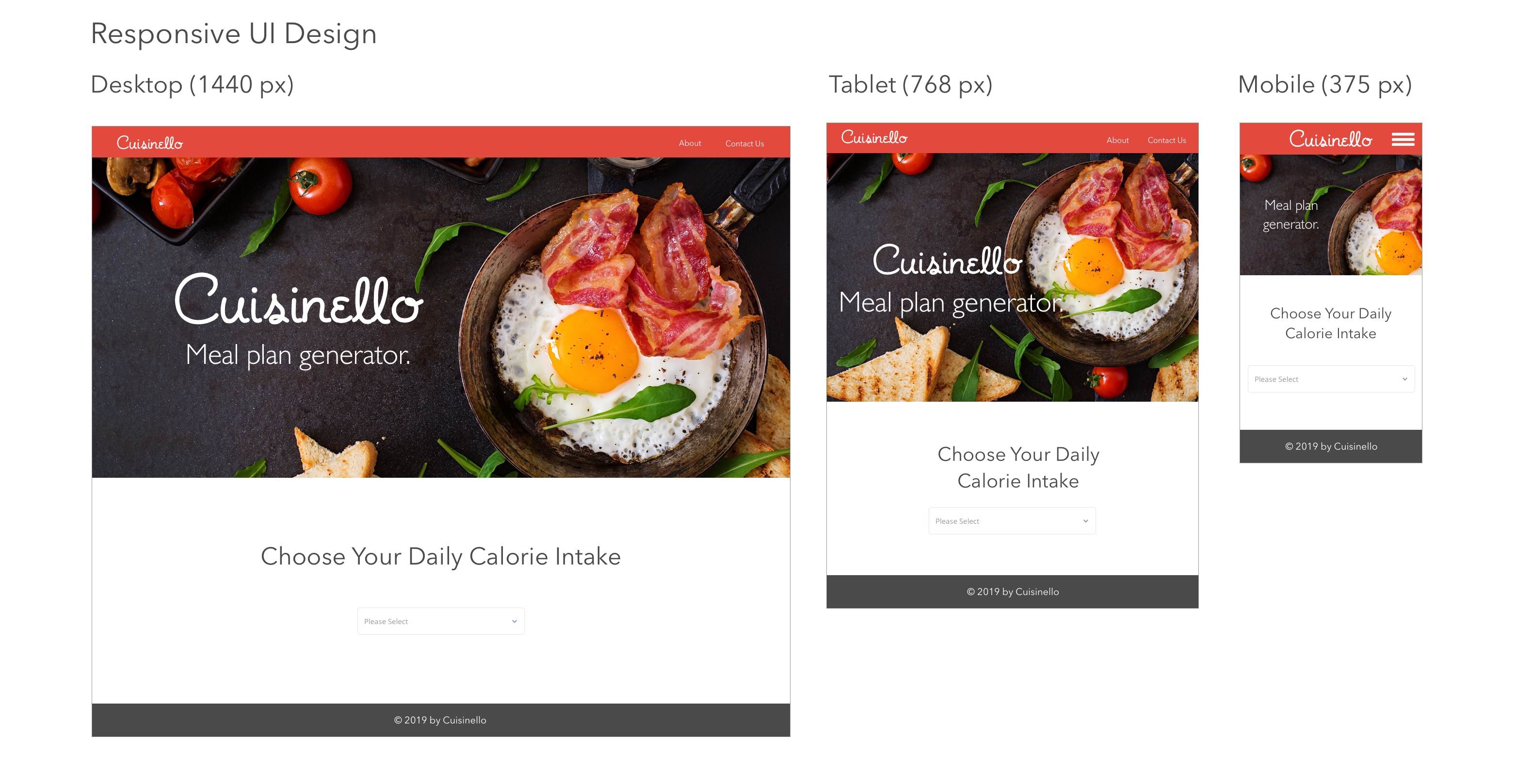
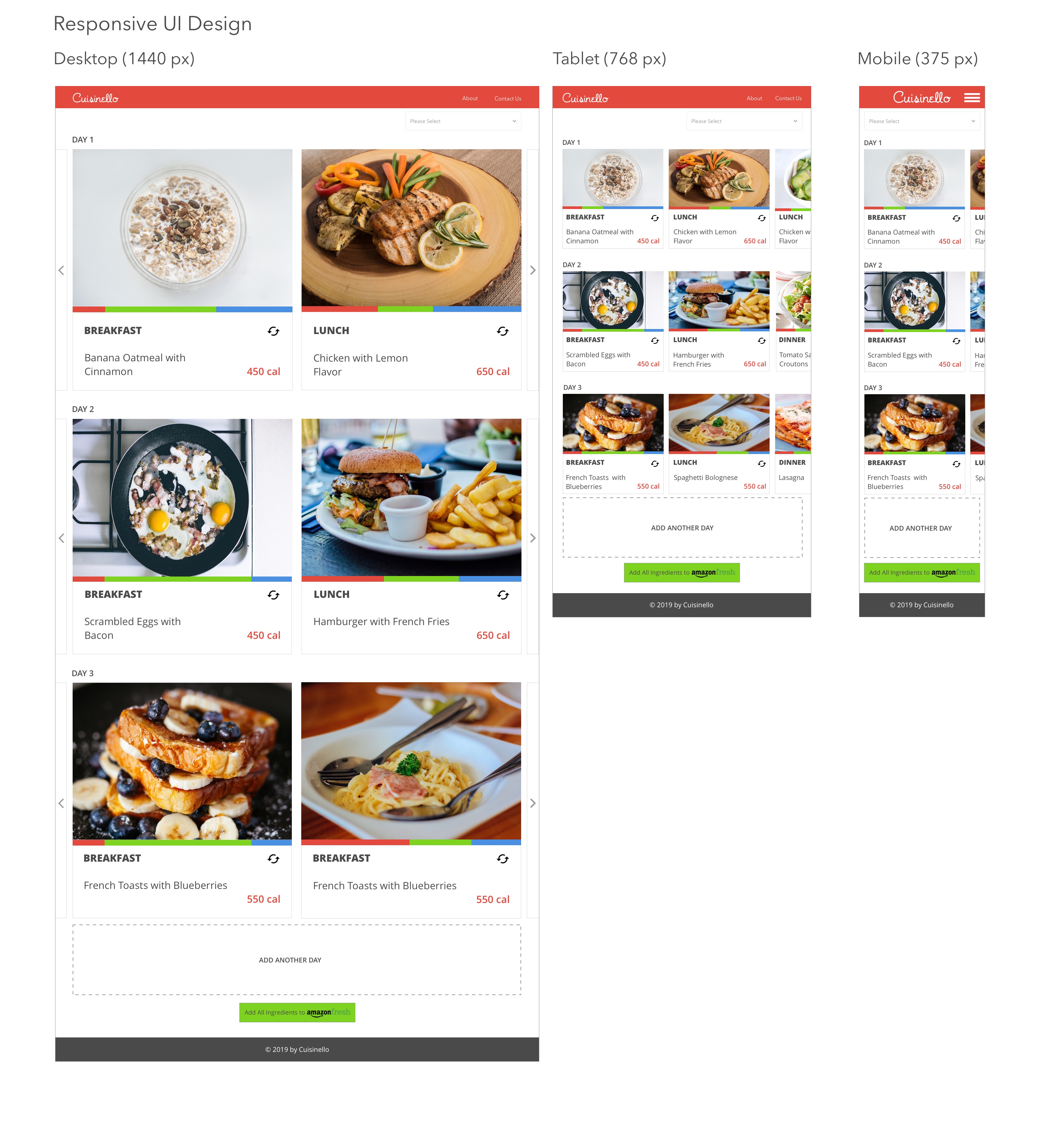
I also designed a responsive website for the project.
Responsive Website Design
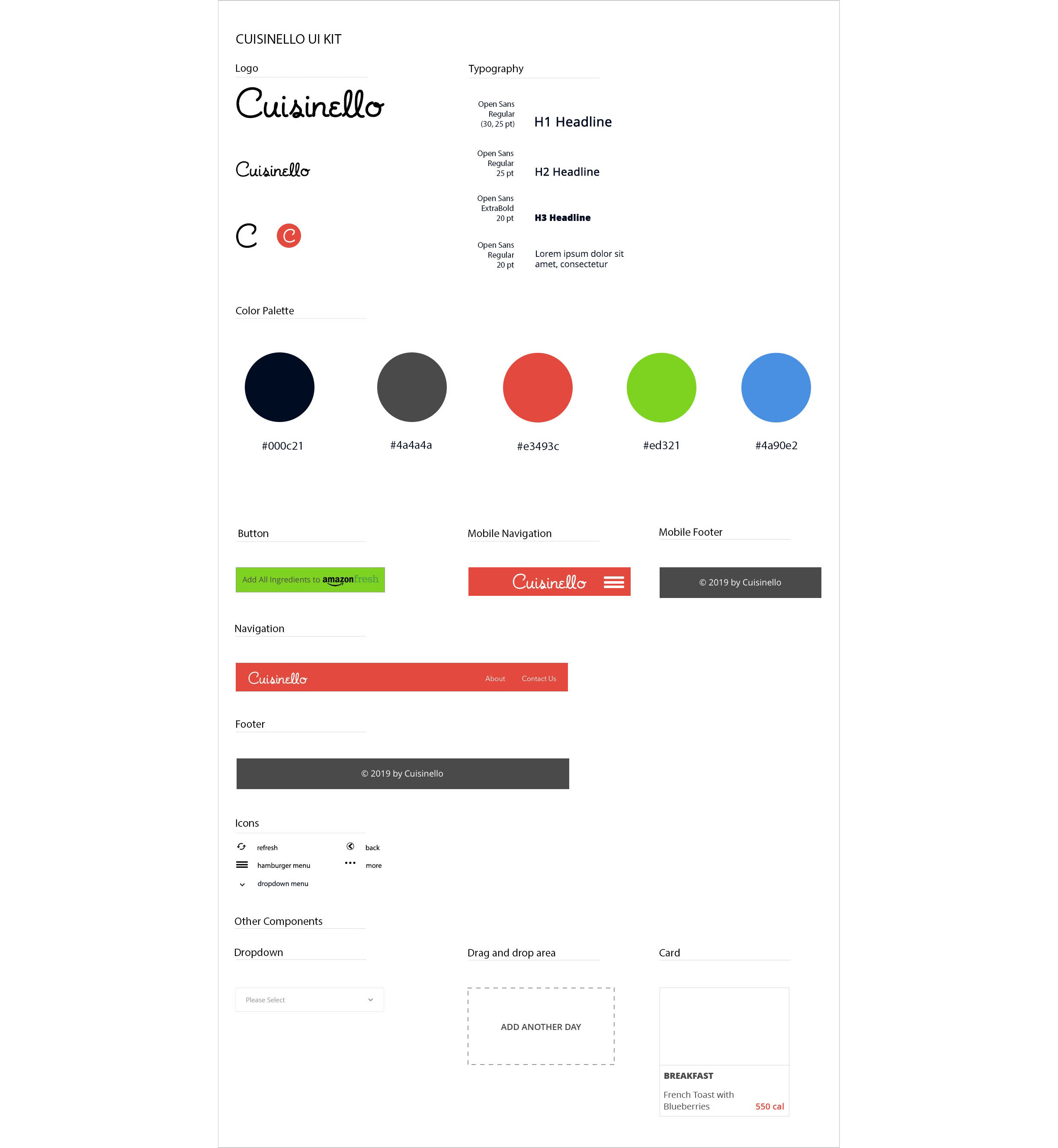
As the last step, I created a UI Kit for future references which included fonts, colors, logo, buttons, icons, a navbar, and a footer.
UI Kit
Summary
In this project, I was challenged to design a minimal and simple interface. The idea was to perform the task in as few clicks as possible. I learned that you can have a simple yet powerful interface. I also learned that you need to maintain many versions of the files for prototyping tools. Sometimes you need to add a bigger margin because of the prototyping tool you’re going to use.
Here's the summary of my process.
Next steps:
- → implement the next priority features
- → conduct more usability tests to test new features
- → update UI Kit with new features